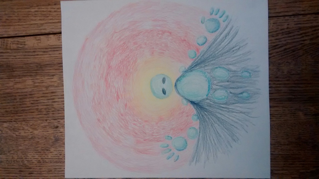
Terribly sorry for the picture being sideways, I couldn't figure out how to turn it right side up on my phone. I'm going to be completely honest, at first when I went into drawing this project it was going to be an independent project for art class, instead of my final. But since it was viewed as my final, I'm just going with the flow. The subject of the picture, is a water creature. The water creature is suppose to coincide with when I was younger, I also drowned but then a dog saved me. Probably why I like golden retrievers so much. So the water creature is having their hands open, welcoming the viewer into their arms. Then like in old paintings, the main subjects representing a godly figure, so they have a halo around their head. I also added a darker blue behind the water creature. what the water creature, and the water cape is suppose to represent is like embracing the viewer into the water. Then I added the halo going from the color yellow, to orange, then red. I really don't know what it's suppose to be, but I like it at least! overall, the whole project was me messing around and "winging it". That's been my moto all year. I personally think the pictures that go unplanned, and are produced from " winging it" are the best because it just goes with the flow. Art shouldn't be planned, it's created through the short inspirations we have. It's been a great pleasure having you as a teacher Ms. Heidamen. You have helped me improve my artwork, dealt with my very late art blog posts, and my random artwork. You have been my favourite teacher ever since geometry, and until the end of my highschool career. I hope I get you as my teacher for ap art next year, have a great summer Ms. Heidamen!!!! (:
I accidently deleted the draft to this, which I am terribly sorry. This one is my least favourite, for I attempted to draw arms and such. To be honest, I drew the flower there to avoid drawing the hands because for one, I'm bad at drawing hands, and for two, I probably should have drawn the flower in the hand white, with no petals, and the one with the petals on the head. I think it's nice clashing complimentary colors together. So the message is "take care of yourself. You only have one body", which in the most part is true. I know a lot of people that do not take care of themselves. Not in like a cleanliness way, but like a physically and/or emotionally way. It makes me very sad that the loveliest people I know, hate themselves the mosts, and hurt themselves for it. Maybe if each and everyone of us took a second to compliment everyone, it could help them in a sense, maybe make themselves feel a tiny bit better. In the end, we all really do only have one body, and one life. Might as well live life to the fullest. I personally like how this one came out. It's cute, and simple. I have always liked freckles, and moles, and pretty much everything because it distinguishes one another from each other. There wasn't much change between my draft and final, I just had to add the positive message. I realize now that I capitalized galaxy, which I do not understand why I did so. I do know that writing capital g's in cursive is fun!! So I must make this clear. My goal is not the art style, or quality - but the message. I restated that in my outline. The next 4 drawings, including this one, are all very simple with a very simple art style. I haven't ever used an ipad for a drawing really, so I wanted to try it out. I wasn't motivated to really draw another realistic portraits, because it takes time. Drawing in this cartoon-y style, takes about a day to finish. I don't really like the idea of themed projects. For this project, I simply drew a girl with plants coming out of the insides. I emotionally relate to this because sometimes I really do wish I was a plant. Plants don't have to go to school, or do homework, or anything. I'm always so stressed out by everything. That is why I put "I wish I was a plant" because I really do feel that way. The hair I'm not to sure of in this, because it's very messy, and you can see the lines which I do not like. I forgot to put the period at the end of the sentence. My handwriting isn't so nice looking - sorry about that. Then the skin didn't stay After a tedious week of drawing, and shading this picture, it is finally complete! First, I would like to apologize for the glare on the project itself to the left, I tried to take a picture of it that would create the least amount of glare. I believe I made the most improvement on this art project all because of the teacher. She gave me a lot of advice on what to do, proportions, etc. I'm really thankful for that! Because of her, I believe this is my best portrait I have drawn yet. Though there are still flaws in it sadly. This might just be me, but the forhead looks a bit off, or a bit too forward, or big, I just don't know. Also, you wouldn't know this without seeing the picture I used as a reference, but the ear is not the same shape exactly. A minor thing no one would notice, but I sure did notice. For the background, I tried making it a light grey because the model's face on paper is mostly white, so instead of having a white background where it blends in, I would have a light grey background to make it stand out a bit more. The light grey turned out too light in my opinion, but if you tilt the computer screen / monitor a bit more than usual, the image does indeed get darker. The picture did turn out lighter than the actual project itself. Honestly, I had a lot of fun drawing this project, and did learn a lot. Sorry for the poor quality of the picture, I took the picture with my phone. I liked how some of the colors turned out throughout the picture. For each circle, I made the very top the lightest, then towards the bottom it would be darker. In the circles, I tried using complimentary colors. The picture I was using as a reference, my friend's skin tone was grey. Though the teacher suggested adding color to the skins tone in the actual picture, so I did. I added either blue, or purple to the grey - sometimes even both. So towards the lighter parts of the circles, I used yellow because it was a complementary color to purple. Towards the darker parts of the circle, I used more purple. I did the same thing for the hat as well. Though the rest of the circles like the coat, horns, or background I didn't really do the light to dark for the circles. Another problem was near the nose, it is really defined, and the other circle next to it isn't as defined as I wanted it to be. Towards the end of the project, I started to rush once again because I was far behind. As the background, since my friend did not allow me to use her prisms colors for coloring it, I used a difference utensil. Since I could not find the color pencils provided from the art class, I used oil pastels instead. It was much easier to color with the oil pastels as well, but a bit messier. The final project honestly turned out better than I had expected. I actually thought of this idea for a project when I first started advanced art. I was actually going to do something close to this concept for my header, but realized it wouldn't be an appropriate header and decided to postpone this. I focused on what colors mashed together well. I also tried a similar art style / technique like Van Gogh, where if you look closely you can tell what directions of the strokes of the paint brush. Honestly those are my favorite type of paintings as well, and I would like to try to figure out how to do so myself as well. For the project, I also messed up on the flower quite a bit, I actually rushed this project just a tad bit. I also "winged" it. Well, I kind of wing all of my projects because I personally believe for myself that to create art it should be by an accident, rather planned out... Like how some science discoveries happen. I actually drew this as practice to get a more hang of drawing people. I don't have all the fancy 6H-6B pencils, so I used a normal pencil which is HB by automatic. Comparing this the original photograph I referred to, the proportions are slightly off. Like the width of the side of the face, it is a bit too small. Except if I tried to make it wider than it was it would look a bit funky. In the end though, I never got to really finish this drawing though. It took me about an hour to draw this in total. Here is the final portrait of the self portraits. This one was honestly my favorite out of all of them I have done. It was also the easiest and fastest portrait out of all because of the lack of detail I can say. On the hair, I didn't really color it all the way, and also didn't add the highlights I believe. The background it seems tehre are a few mistakes in coloring, or it might have been that way on purpose. The eye turned out fairly well unlike the third portrait. The most bothersome thing though is that I didn't color the background all the way because one can notice the small ring of white around the hair. I actually did the background after the hair, which was a no-no. People say the third time is the charm, but in some people's cases it is not always true. I would say that my luck was the opposite of it's suppose to be. Now that the original picture can now recognize my face, that meant I had now draw more detail. The qualities that did turn out well in this turn was the hair once again, and the colors. I could have worked on the hair more, but I just wanted to start my fourth portrait because I wanted to catch up. I like how the background turned out in this one as well, but I believe the chalk actually started to make black marks on it. Rylee said it was because I was using the chalk to hard, but I used it even lighter than before and it still made the black marks. As much as I tried the black marks still remainded some what visible. I believe I did a well job on coloring, and I used the advice of the teacher to use complementary together which gave it a nice pop and settle look. I find the eyes absolutely horrid. The left pupil is oddly shapped, I didn't correctly shade the whites, and they don't look fully colored in. On another note, I actually put my nose a bit to higher than it should be. If I noticed this before, I would have fixed it and the picture would have looked more normal rather than creepy. |
AuthorWrite something about yourself. No need to be fancy, just an overview. Archives
June 2014
Categories |