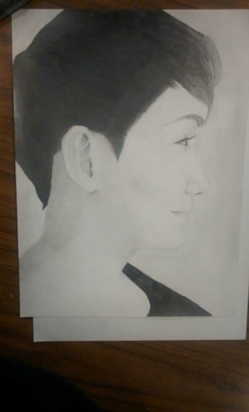
After a tedious week of drawing, and shading this picture, it is finally complete! First, I would like to apologize for the glare on the project itself to the left, I tried to take a picture of it that would create the least amount of glare. I believe I made the most improvement on this art project all because of the teacher. She gave me a lot of advice on what to do, proportions, etc. I'm really thankful for that! Because of her, I believe this is my best portrait I have drawn yet. Though there are still flaws in it sadly. This might just be me, but the forhead looks a bit off, or a bit too forward, or big, I just don't know. Also, you wouldn't know this without seeing the picture I used as a reference, but the ear is not the same shape exactly. A minor thing no one would notice, but I sure did notice. For the background, I tried making it a light grey because the model's face on paper is mostly white, so instead of having a white background where it blends in, I would have a light grey background to make it stand out a bit more. The light grey turned out too light in my opinion, but if you tilt the computer screen / monitor a bit more than usual, the image does indeed get darker. The picture did turn out lighter than the actual project itself. Honestly, I had a lot of fun drawing this project, and did learn a lot.
 RSS Feed
