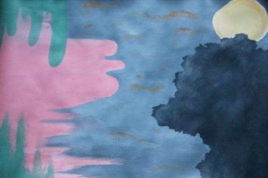
Once again for this project, I did not create any drafts for it because I felt I should try to go with the flow. The song I chose was Rare Bird by Glen Hansard. The tone of the song was a bit happy but at the same time rather sad. So I tried to mix both warm and cool colors. The song was more rather sad sounding than happy, so in the project I had the cooler colors overlap the warmer colors representing the overpowerment of the sadness. I have realized I did focus on putting more objects and such at the corners of the project, which was my mistake. So, I added a few bits of lines in different forms containing the colors red, orange, and yellow. They are suppose to represent that even if one thing is over come by sadness, there is still hope, or rather happiness just somewhere... It's just not easily seen.
Note: I am terribly sorry for not having really any drafts for literally any of the projects, yes I did do them but I didn't know what I was suppose to put for each draft actually. Next semester for sure will change for I will try to upload drafts along with the final projects. Once again, I am terribly sorry for the inconvenience!!
Note: I am terribly sorry for not having really any drafts for literally any of the projects, yes I did do them but I didn't know what I was suppose to put for each draft actually. Next semester for sure will change for I will try to upload drafts along with the final projects. Once again, I am terribly sorry for the inconvenience!!
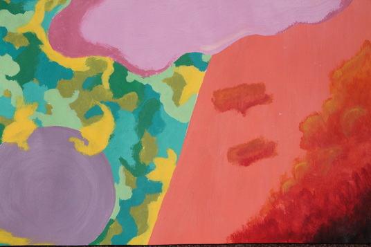
This project, I had a bit of fun with. To be honest, I had no idea what I was doing from the start. I just followed the current instructions, not really trying to thinking of what I was painting. So to say, I pretty much winged it. I tried focusing on using many colors, not using the same color over again. I didn't really want to add blue anywhere, especially on the orange because that would remind me of the broncos. Not that I have anything against the Broncos, I personally find it unsettling to look at my own artwork and see the colors of sports teams there. I just don't want to be reminded of sports while looking at the art, I want my mind to be more creative than that. I had a lot of fun painting this in fact, especially painting the many yellows, oranges, and reds in the bottom right hand corner. It reminds me of clouds, or even trees by chance. I say we should have more projects like this, or just projects that let us express our creativity ourselves rather than drawing a hallway, or a paperclip and such.
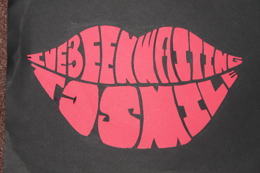
Originally, the line "I've been waiting to smile" comes from the song On Top of the World by Imagine Dragons. It's a rather simple concept, forming the phrase into lips that are smiling. I didn't realize it was kind of sad at all, and I didn't mean it to be. I just really liked the song because it usually brings my mood up. I really only had one problem doing this project. It was the capital O, A, and B. I had completely forgotten about that they had holes in the letters, so I had to work around that. The B and the A turned out alright, but the O... Not so much as I was hoping. It looks like a backwards C if I look at it long enough. Hopefully that error doesn't affect the reader reading the phrase. Then there is actually a reason why I chose red as the background color. It's because I really like red lipstick!! And then adding the black, it reminds me of the Rocky Horror Show.
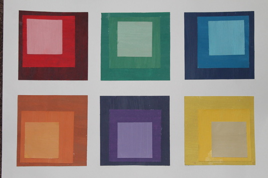
This is the project that we finally get to start painting. For myself, I would prefer painting over the other types of art any day. Except for this project, we didn't have any rough drafts or such. While finding the colors, I only really had trouble finding the lightest yellow. Then when realizing to late after I have already painted, the lightest hue of yellow I chose didn't quite go with the others. Then another difficulty was mixing the 2nd yellow. It was suppose to be the vibrant, bright yellow but I got it to as close as I could.
Honestly, I had fun with this project but I also got a bit stressed with it as well. Through the beginning to the end, the teacher was gone most of the time so I wasn't so sure on what kind of item I could pick. Luckily I did have friends that already did this assignment for a past class that helped me. However, I chose to be one of those uncreative students and chose the example from the website - a paperclip. Except instead of a flat paperclip, the teacher suggested a bit of a bend to it. After the rough drafts and such, it was rather easy after that. The charcoal was rather fun to use and hard since I hadn't really used it before. Actually so far, this project was my best final yet in my personal beliefs.
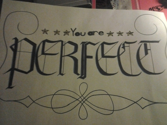
Through out the drafts, I once again focused mostly on the font of the text. Actually, in each draft I was practicing on how to situate the whole text onto the piece of paper. I kept running into problems like it was to small, or one or two letters wouldn't be able to fit. For the final, the font did relatively came out well. Except, the design... Not as much. Like the other banner I created, it lacks creativity, or any eye catchers. I tried to make it fancy in some way, but it didn't work out to well.
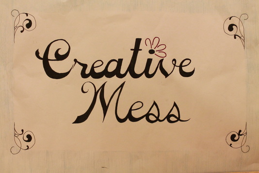
I did not like this project honestly because it was kind of broad in fact. For most of the drafts, I was trying to figure out which font to use to express myself better. Though due to all my attention on the font, I never really got to decorate it really. It doesn't express any creativity besides through the text. I at least got to add a flower due to my love of flowers but that's literally all. The banner is suppose to show who the artist is I believe, and I didn't do the right job to do so.
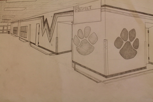
Originally I was going to sketch the hallway near the back entrance to the cafeteria, but decided to go with the math hallway instead. I chose that route because the hallway seemed more easier, and there wasn't any ramp of any such sort. The final picture you see currently is actually the second final, because I lost the first one some how (later to be found in my shelf). This final is actually better then the first one despite having less time to work on it.
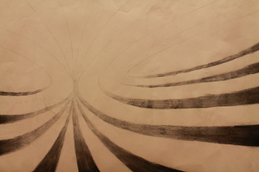
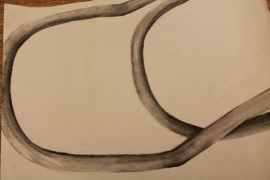
At first my original idea was to create something that was similar to ripples in the water. Then around the second or third draft, I thought of having something similar to ripples - colliding galaxies. I combined both the ideas into one, in ways. My idea is rather different from previous student's designs, but I felt best to go with this one because of so. The final isn't want I imagined at first, but I like it to an extent.
